

Interactive map shows risk of encountering COVID-19 at events of different sizes across the country
NEW YORK -- An interactive online map allows people to assess their risk of encountering someone infected with COVID-19 at an event, based on the size of the gathering as well as the county in which the gathering is being held.
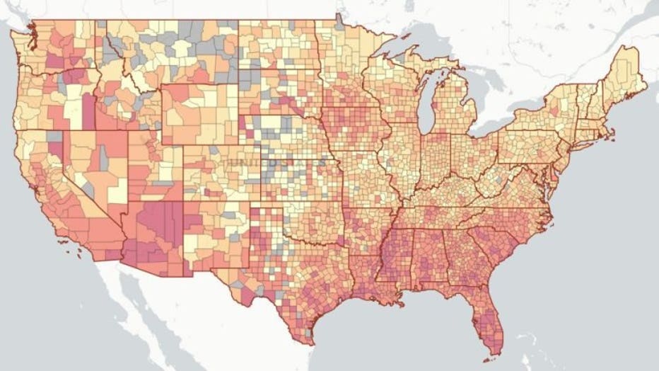
The dashboard allows users to zoom in on a county anywhere in the U.S. and choose an event size ranging between 10 people to 10,000 people. The tool then calculates the risk level of attending that event, based on the assumption that at least one COVID-19 positive individual will be present.
For a July 15 event with 100 attendees on in Fulton County, Georgia, a county which encompasses Atlanta, the estimated risk of someone in attendance being actively infected with the novel coronavirus was 99%. For 1,000 attendees at that same event, the estimated risk exceeds 99%. The risk level was also true for similar-sized events in many counties across the country.
The COVID-19 Event Risk Assessment Planning Tool was developed by researchers at Georgia Tech. (Photo credit: Provided / Georgia Tech)
For an event on July 15 with 10 people in attendance in Los Angeles County, California, the estimated risk of encountering COVID-19 on was 30%. For a gathering of 100 people in the county, the percentage jumped to 97%.
In Maricopa County, Arizona, which encompasses Phoenix, an event with just 10 people on July 15 showed a 57% chance of encountering someone who was infected with COVID-19. The estimated risk level at an event in that county with 100 people exceeded 99%.
The map, called the COVID-19 Event Risk Assessment Planning Tool, was developed by researchers at Georgia Tech. It pulls data from The New York Times case count and The COVID Tracking Project by The Atlantic, both of which base their number of confirmed cases on reports from state-level public health departments.
“The issue of understanding risks associated with gatherings is even more relevant as many kinds of businesses, including sports and universities, are considering how to re-open safely,” said Joshua Weitz, a professor in the School of Biological Sciences and founding director of Georgia Tech’s Ph.D. in Quantitative Biosciences program, who helped develop the tool.
Leading epidemiologists in the U.S. have pulled their efforts in other ways to help Americans determine if they live in an area that has a high rate of COVID-19 transmission.
The Harvard Global Health Institute, in conjunction with other organizations, launched a “COVID Risk Level” map earlier this month, which uses a color-coded system to illustrate a county or a state’s COVID-19 risk level based upon the new number of daily cases reported per 100,000 people.
More than 13 million confirmed cases of COVID-19 have been reported worldwide since the first patients were hospitalized in China in December 2019. And according to data compiled by Johns Hopkins University, more than 578,000 people have died.
The U.S. leads the world in both confirmed cases and deaths with more than 3.4 million infections and 136,000 deaths reported.
Hospitals across the country have been running out of space amid a resurgence of cases and hospitalizations. As of July 14, nearly 54,000 patients nationwide were hospitalized for COVID-19, and 38 states were seeing an upward trend in newly confirmed cases.
This story was reported from Cincinnati.